The LifeScan OneTouch VerioSync – the magic of wireless blood glucose data to your iPhone/iPod/iPad
By Adam Brown

by Adam Brown
twitter summary: LifeScan’s OneTouch VerioSync meter and Reveal app – wirelessly sending glucose data to your smartphone …without needing an instruction manual!
According to Pew Research (May 2013), 56% of Americans own smartphones, which is up substantially from 35% just two years prior. Given their dramatic rise in popularity, their usefulness, and their near-24/7 presence in our lives, it seems like a no-brainer that they should seamlessly interface with our diabetes devices. We’ve written about and tested several such products in past issues of diaTribe, including Sanofi’s iBGStar, Telcare’s meter, Glooko’s MeterSync Cable, iHealthLab’s Smart-Gluco Monitoring System, and Dexcom Share. LifeScan’s OneTouch VerioSync, one of the newest connected meter offerings, was FDA approved in February 2013 and launched this past January.
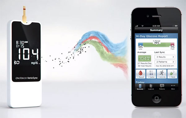
With the VerioSync, LifeScan took the very well-designed VerioIQ meter (which we test drove in diaTribe #41), stripped some of the on-meter functionality out (color screen, buttons, menus), added Bluetooth connectivity, and built a sleek accompanying iPhone/iPod/iPad app (called OneTouch Reveal in the iTunes store). After performing a glucose test, the VerioSync meter will automatically send the glucose value to the app (provided it is open on the smartphone) and incorporate it into statistics, patterns, a logbook, and more. This article reviews my experience using the meter and the accompanying OneTouch Reveal app over several weeks.
The VerioSync Meter
 I really appreciated the VerioSync meter’s minimalist design, which keeps it small and puts all the value in the accompanying smartphone app. To start, it’s one of the smallest and slimmest meters I’ve ever used, at just half an inch thick, 3.9 inches long, and 1.6 inches wide. The small profile made it incredibly easy to fit into pretty much any carrying case or pocket I could think of. After pulling it out of the box, it was immediately clear to me that this meter is designed for simplicity – it has no user interface to speak of and just a single button to turn the meter on/off and toggle the light and Bluetooth. All the history, pattern recognition, and settings are in the accompanying app. This was a disciplined design choice that I appreciated – I’d rather have a smaller, stripped down meter that does one thing really well (testing and displaying the current value) than a lot of things only moderately well.
Inserting a strip into the meter automatically turns it on, and after applying blood to the thoughtfully designed Verio strips (reviewed in our test drive of the VerioIQ), the result is displayed on the meter’s high-contrast black-and-white screen in five seconds. It’s truly a five second test, unlike other meters that count down from five but actually take more like seven or ten seconds. Though the screen is black-and-white, I found the high-contrast, large digits very easy to read. Some might prefer a meter with a color screen, but I thought the black-and-white display was fine given the colorful accompanying app.
Unlike many other meters that run on AA, AAA, or coin cell batteries that last a very long time, the VerioSync is rechargeable via micro-USB. A full charge of the meter takes two hours and lasts one to two weeks. I didn’t mind this part – I charge pretty much every device in my life, including my Dexcom CGM – but I recognize this could be a deal breaker for some patients. I was very glad to see that the VerioSync retained the VerioIQ’s port light, which made it very easy to test in the dark. In my view, the port light is an underappreciated design feature on glucose meters, given how often I wake up and test in the middle of the night.
The OneTouch Reveal App
 The VerioSync’s accompanying app – OneTouch Reveal – is the major highlight of the system. Once downloaded and installed, you must Bluetooth “pair” the meter with the app, which took less than 30 seconds and did not require an instruction manual (that’s my bar for well-designed diabetes technology!). The app even knew that the time on my meter was wrong and needed to be changed.
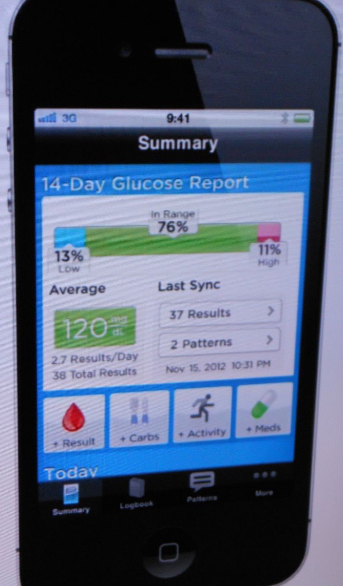
From there, I was off and running. I tested my glucose on the VerioSync meter, and within a few seconds after the test result, the number was transferred to the app. No cables. No fuss. No fingers crossed. It just worked. Magic! A popup window on the app showed the result (blue for hypoglycemic, red for hyperglycemic), the time of day and date, and allowed me to easily tag it pre- or post-meal. The result was also immediately incorporated into the app’s statistics, logbooks, and patterns. The app is intuitive to navigate through and has four main menus: Summary, Logbook, Patterns, and More (settings, help, reminders, contact OneTouch).
I was a big fan of the Reveal app’s summary home screen, which LifeScan clearly put a lot of thought into. To my excitement, the first thing you see is a colorful time-in-range chart (blue for hypoglycemia, green for in-range, red for hyperglycemia), which told me exactly how I was doing with my diabetes management. Seeing a 70% time-in-range figure let me know I was doing pretty well (motivational), while a 20% time below range was a red flag that I was experiencing too much hypoglycemia. (The time-in-range values are highly customizable in the app’s settings). The summary screen also displays average blood glucose in large font, which was a nice high-level metric to see but far less actionable than time in range.
Back when I tested the VerioIQ, I was impressed with its novel high and low pattern recognition feature. This has been retained in the Reveal app and is another major highlight of LifeScan’s new meter. After performing a sync, the Reveal app immediately notified me with a popup message if I had any high or low glucose patterns. Relative to the VerioIQ’s small color screen, I thought that the app did a better job of summarizing patterns and giving me clear direction on what times of day to address.
Last but not least, the Reveal app makes it fairly easy to share results via email or text message. I simply navigated to any screen on the app, held my finger down for three seconds, and a “Share” button popped up. With two clicks, I had an email or text open with a picture of the screen I was currently on. The low hassle factor to Share results was great, though this part of the app could be significantly improved (see below).
Areas for Improvement
-
Automatic upload: The Reveal app only downloads the values from the VerioSync meter when the app is open on your Apple device. In other words, it does not push the values to the app in real-time in the background. The meter can hold up to 500 tests in its memory, so there’s really no fear of losing the data if you go some time without syncing the data to your Apple device. However, it would be great if the values went straight to the app or a web-based platform, where pattern recognition and statistics would happen in the background and notify me. There’s no doubt that it was extremely easy to sync the meter with the app, but at minimum, I still had to remember to do it. This is one nice feature of the Telcare’s meter, which sends meter results to the cloud automatically in near real-time.
-
Sharing: Overall, I was disappointed that the Reveal app did not have a nice PDF report feature like the Glooko or mySugr apps – these summarize the data well, are easy to email or to print, and can be brought to a visit with a healthcare provider. I found the app’s screenshot approach to be quite limiting, particularly because certain screens require scrolling and thus get cut off in the screenshot. It was also not particularly intuitive to hold my finger down and pull up the “Share” button – most apps have a dedicated on-screen arrow icon for sharing. Last, an ability to send the raw numerical data for analysis in another program (e.g., Microsoft Excel) would have been useful.
-
Meal tagging: Meal tagging can only be done on the Reveal app once meter values are downloaded. When I hadn’t synced the meter with the app in a few days, it was hard to remember whether values from two days ago were pre or post-meal. My normal meter doesn’t have meal tagging, so I wasn’t necessarily incapacitated without this feature. However, the VerioSync will only give high patterns if you meal tag, meaning that forgetting these tags skips out on half the pattern recognition’s value (low patterns appear whether you tag or not). Ideally, meal tagging could be done on the meter with a single button.
Concluding Thoughts
Overall, I had a very good experience with LifeScan’s OneTouch VerioSync. The system makes a huge stride in making it easier to quickly download glucose data, analyze it, and make some diabetes management changes. I really appreciated that it didn’t need an instruction manual, required limited set-up, and worked right out of the box. As I think about the future of diabetes technology, I’m confident that the VerioSync is a good sign of things to come – low hassle, easy-to-use, time-saving devices that work seamlessly with the other electronics we use on a daily basis.
Adam is the co-managing editor of diaTribe and Chief of Staff at Close Concerns. He is a graduate of the University of Pennsylvania and serves on the board of Insulindependence and the San Francisco branch of JDRF. He was diagnosed with type 1 diabetes at the age of 12 and has worn an insulin pump for the last 11 years and a CGM for the past three years. Most of Adam's writing for diaTribe focuses on diabetes technology, including blood glucose meters, CGMs, insulin pumps, and the artificial pancreas. Adam is passionate about exercise, nutrition, and wellness and spends his free time outdoors and staying active. He can be contacted at adam.brown@diatribe.org or @asbrown1 on twitter.
Interested in learning more about the latest product and research news in diabetes? Sign up here and receive free updates on future diaTribe articles.


